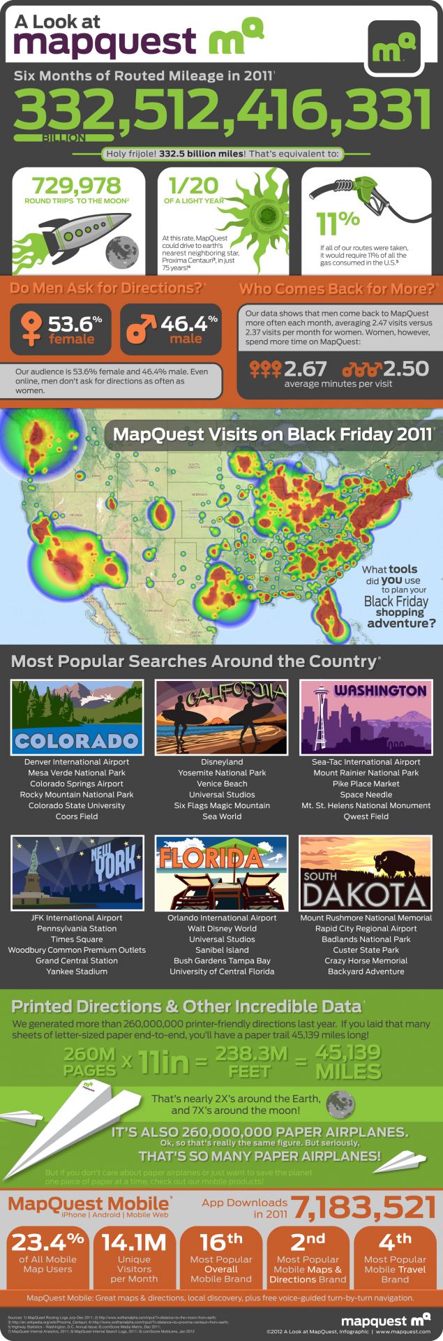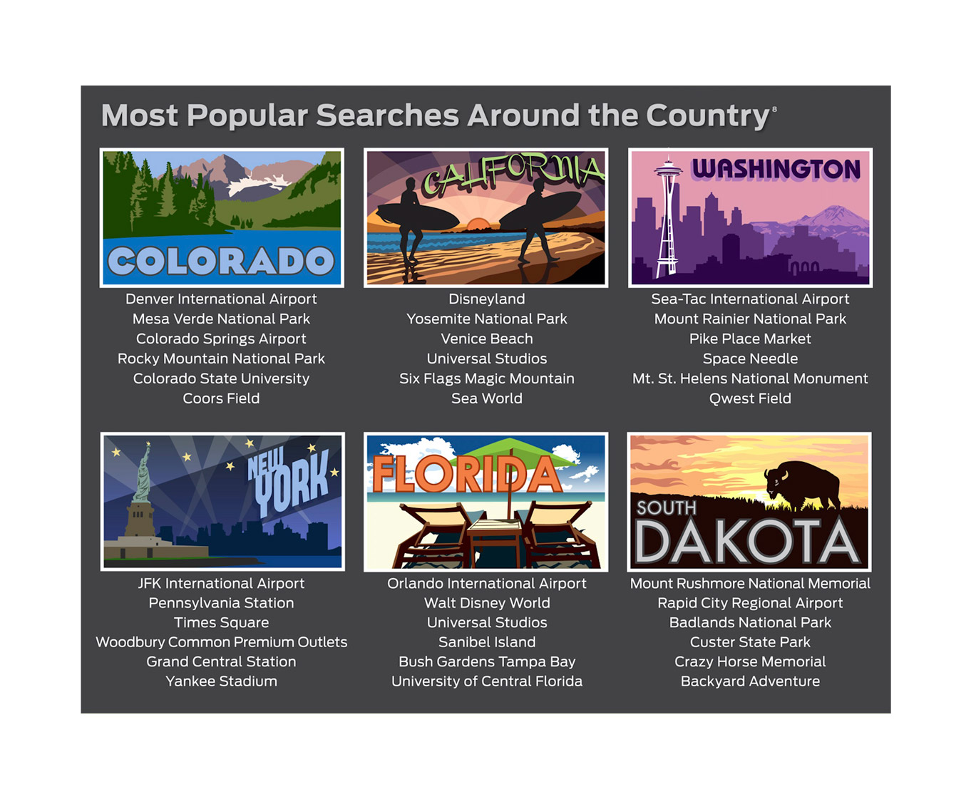
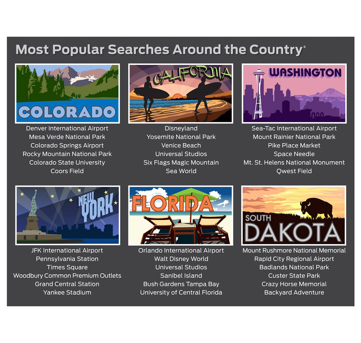
MapQuest wanted to develop an infographic which had a goal to visualize the massive amount of location & mapping data that MapQuest collected in the 2nd half of 2011. Fermentable Sugar worked closely with the MapQuest team to examine their massive data set and then helped break the data into palatable chunks. We performed several rounds of design to come to a final. Highlights of this project include several postcard-style illustrations that focused on locations of interest to MapQuest users.