Bierstadt Lagerhaus is a brewery in Denver. The brewers are the very capable Bill Eye (former head brewer at Dry Dock and owner/brewer at Prost Brewing), Ashleigh Carter (formerly at Dry Dock & Prost), and Chris Rippe (formerly of Flying Dog Brewery & proprietor of The Rackhouse).
Visual Branding
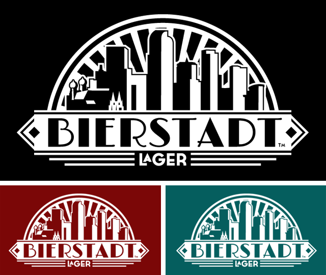
Once it was decided that Bill, Ashleigh and Chris were going to work together, they came to Fermentable Sugar to develop visual branding. The direction of the mark was already somewhat decided, but the time had come to bring in a professional company with previous brewery experience to take their idea and turn it into a functional brand identity. Bill, Chris & Ashleigh were set on an art Deco feel to brand their brewery, which had recently purchased a 1930s German brewhouse that was cut out of its previous location and shipped to Denver. In the course of about a month, we took a concept and performed a series of rounds of design to end up with a final mark. The branding features the Denver skyline (with a touch of Munich, an homage to their roots as a German lager brewery), and an art deco badge that houses the BIERSTADT lettering.
Given that there is a lot of black on the edges of the mark, a reverse logo was needed for dark backgrounds. The essential elements are the same, but there is a lot of contrast in the reverse grayscale logo.
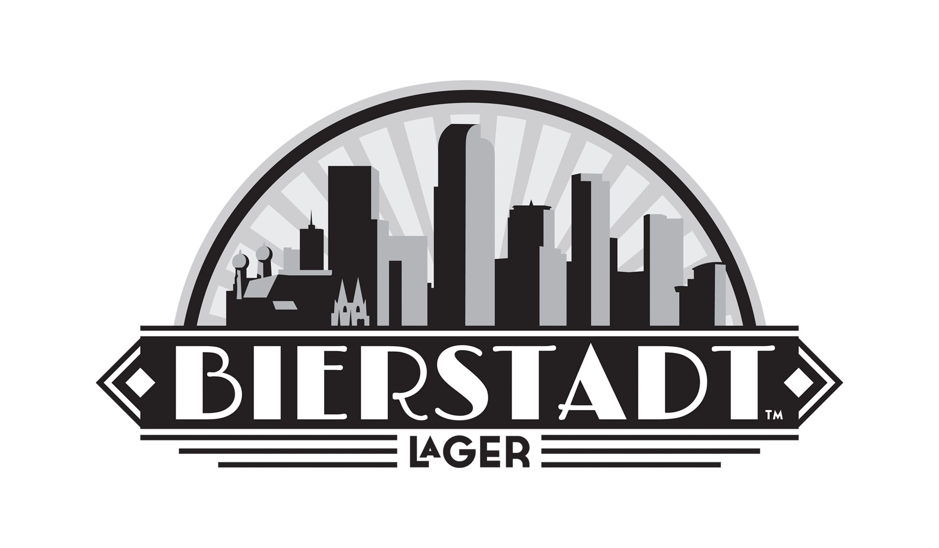
Developed as a grayscale mark, The Bierstadt Lagerhaus branding excels as a 1‑color mark. It’s difficult to condense a brand that uses 5 values of black into a 1‑color brand. This logo will be used for things like silkscreening (when the client doesn’t want to print a logo with 5 different gray spot colors).

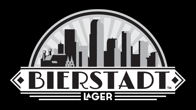
The reverse of the 1‑color branding is just as visually appealing and stands out so well on dark backgrounds.