Name Ideation
Fermentable Sugar presented about 50 possible company names to the client, who sells all-premium natural sunflower seeds. The client selected Chinook Seedery out of the options. A Chinook is a warm wind that blows across the western part of North America, a prime location for growing sunflowers to harvest their seeds.
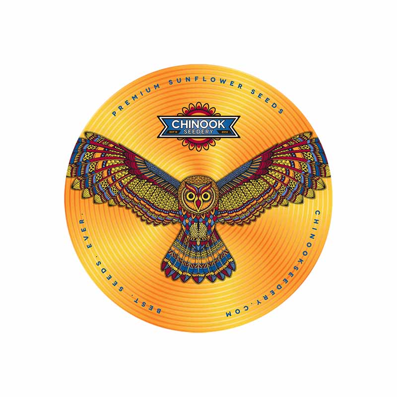
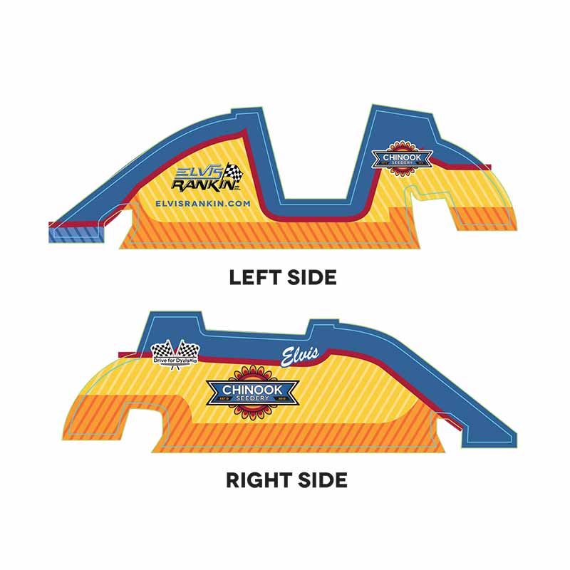
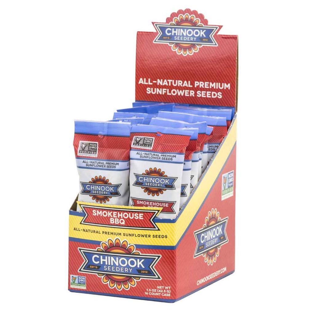
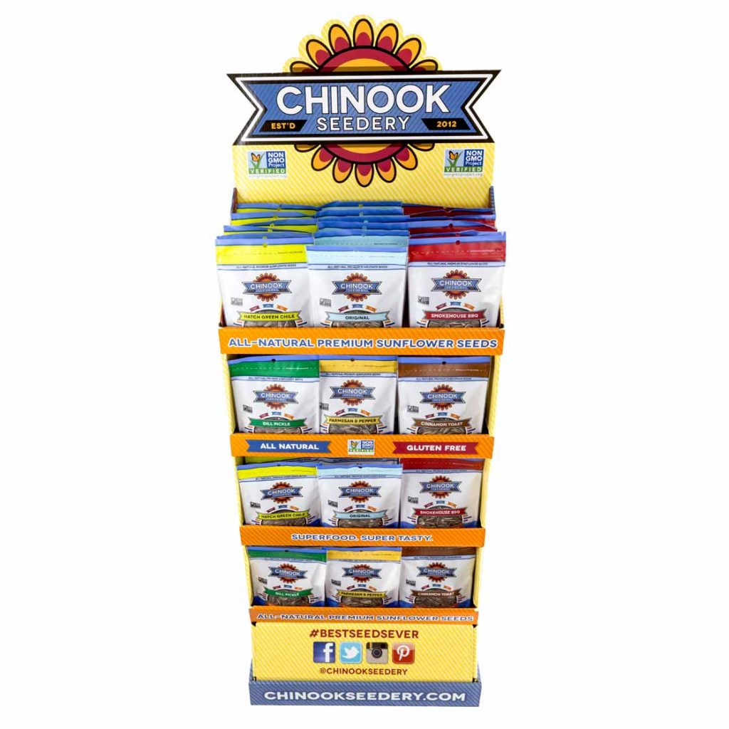
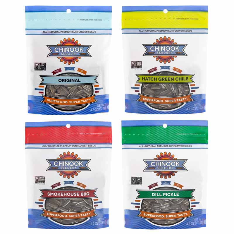
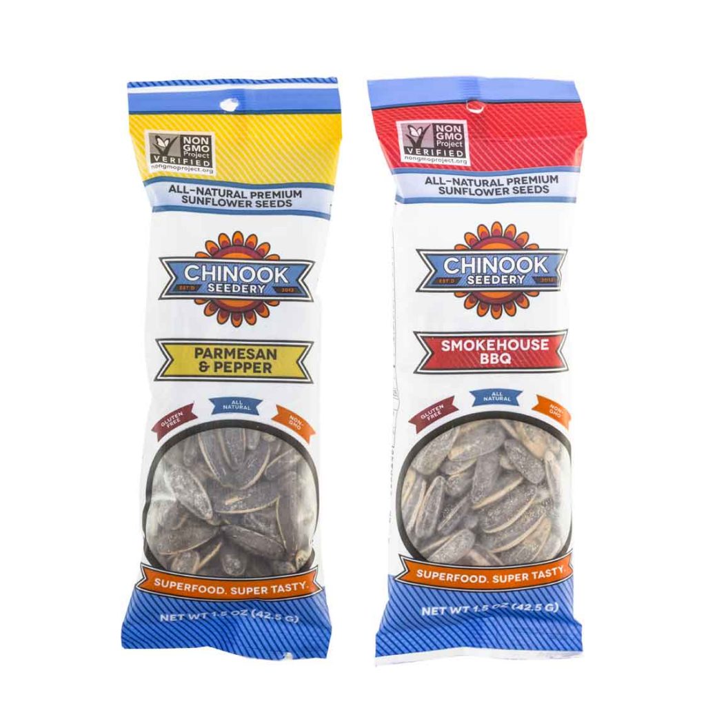
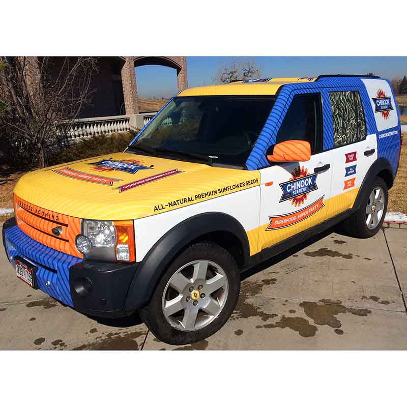
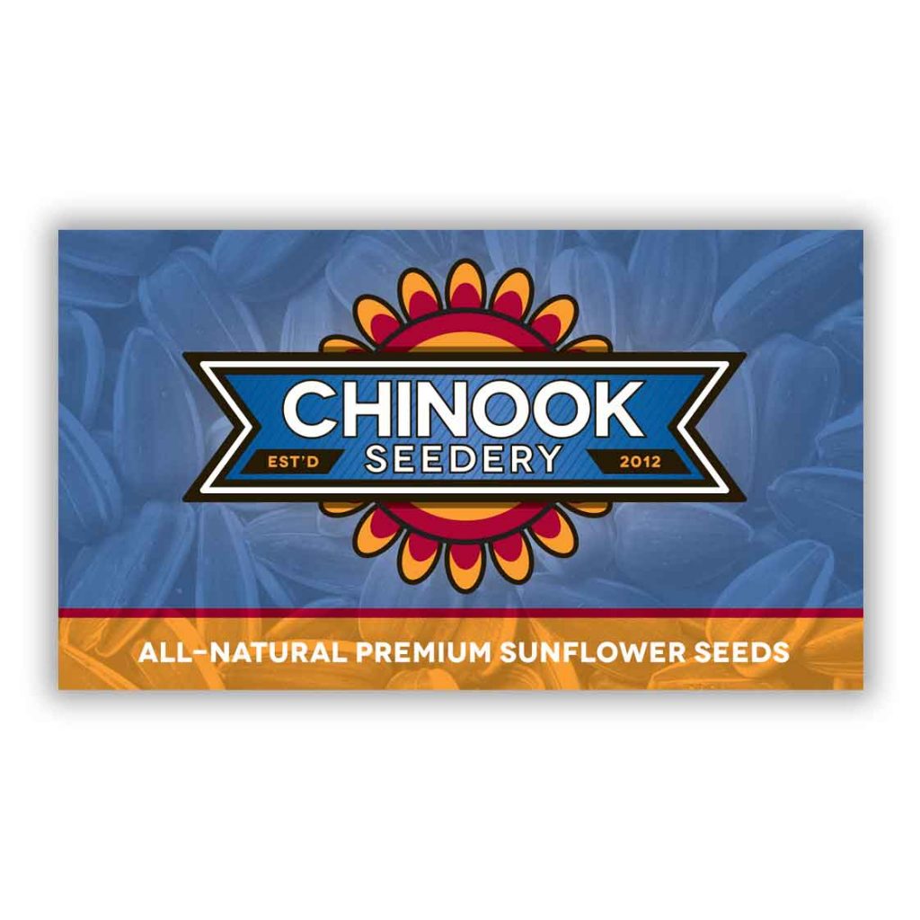
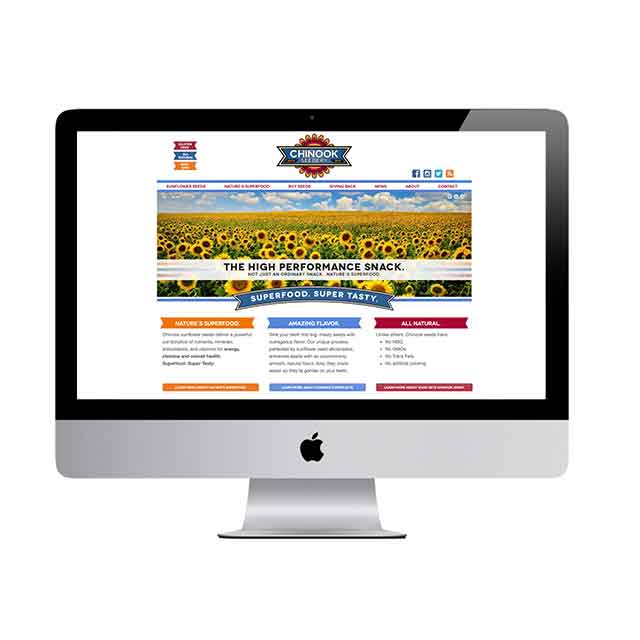
Visual Branding
The client wanted a brand that would reflect the high-quality sunflower seeds, and would stand out on high-end supermarket shelves — they started their company after noticing that there were no in-shell sunflower seeds sold at Whole Foods. We used the sunflower as a jumping off point for Chinook’s visual branding. The addition of a blue ribbon complements the orange and red of the sunflower design while adding contrast between the elements.