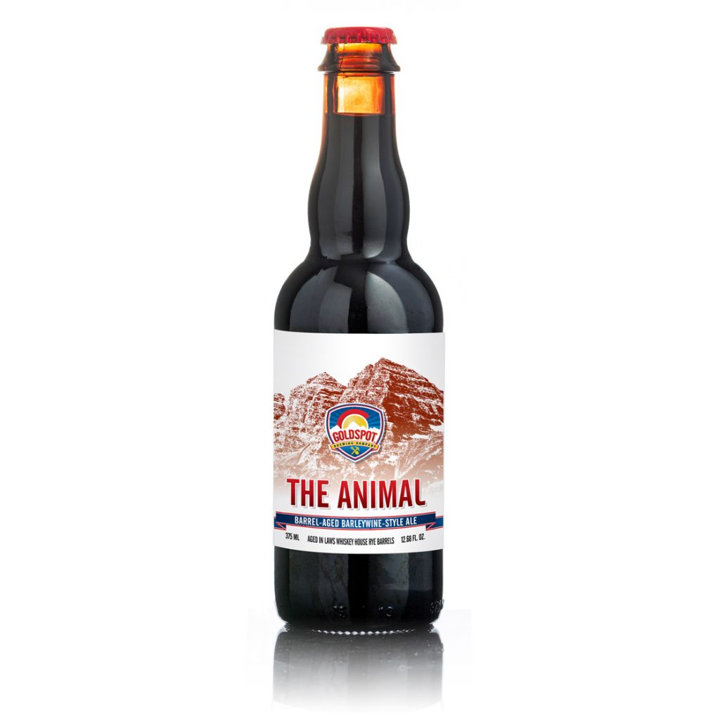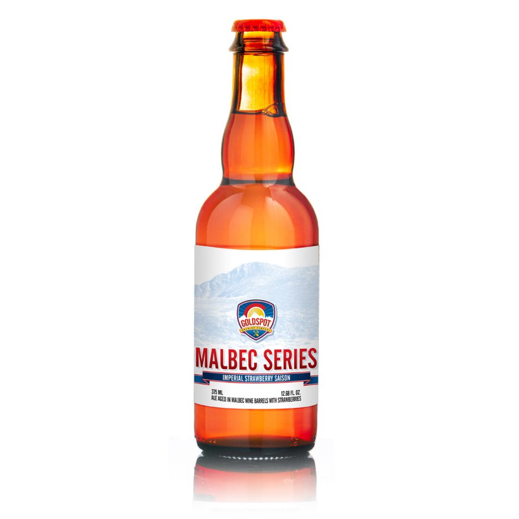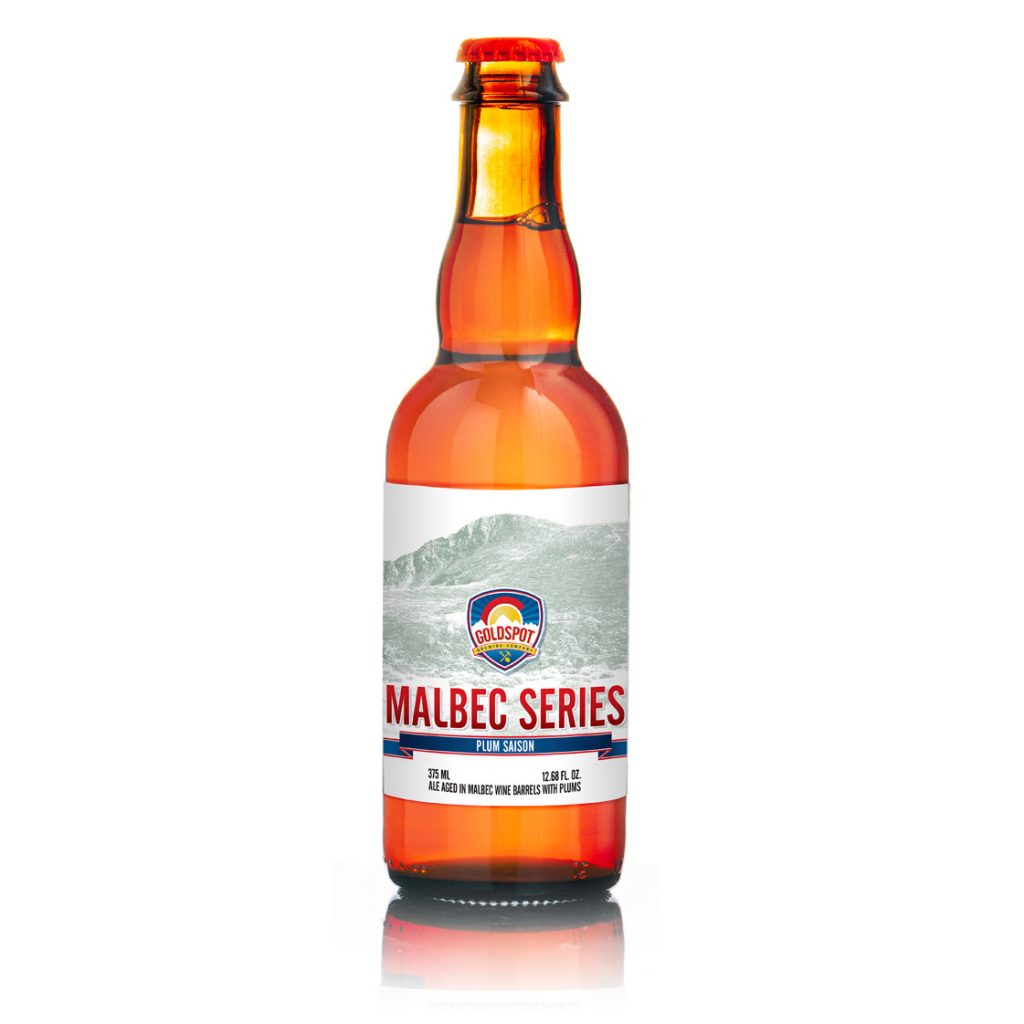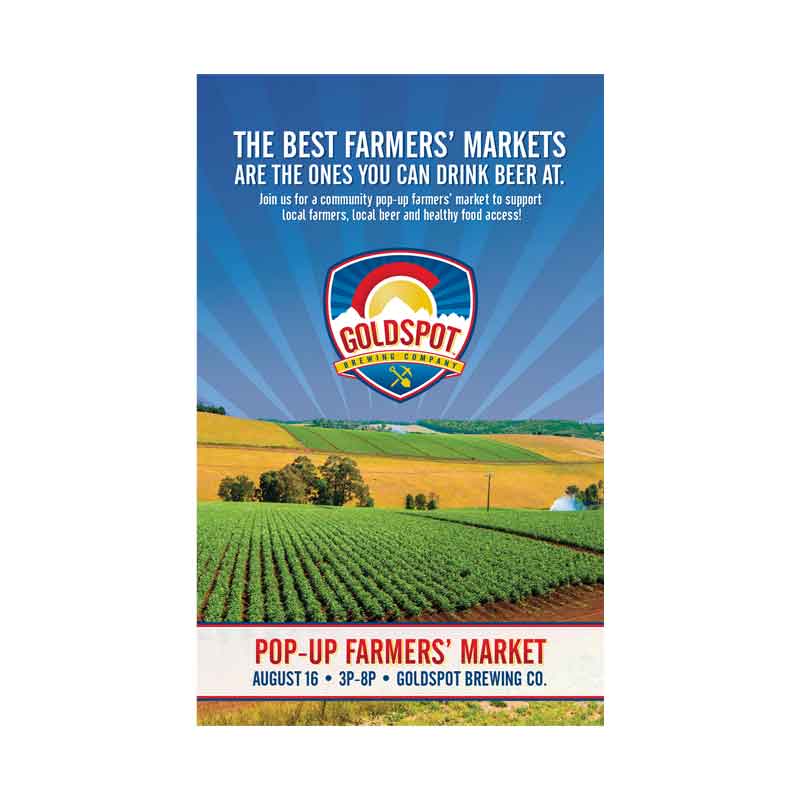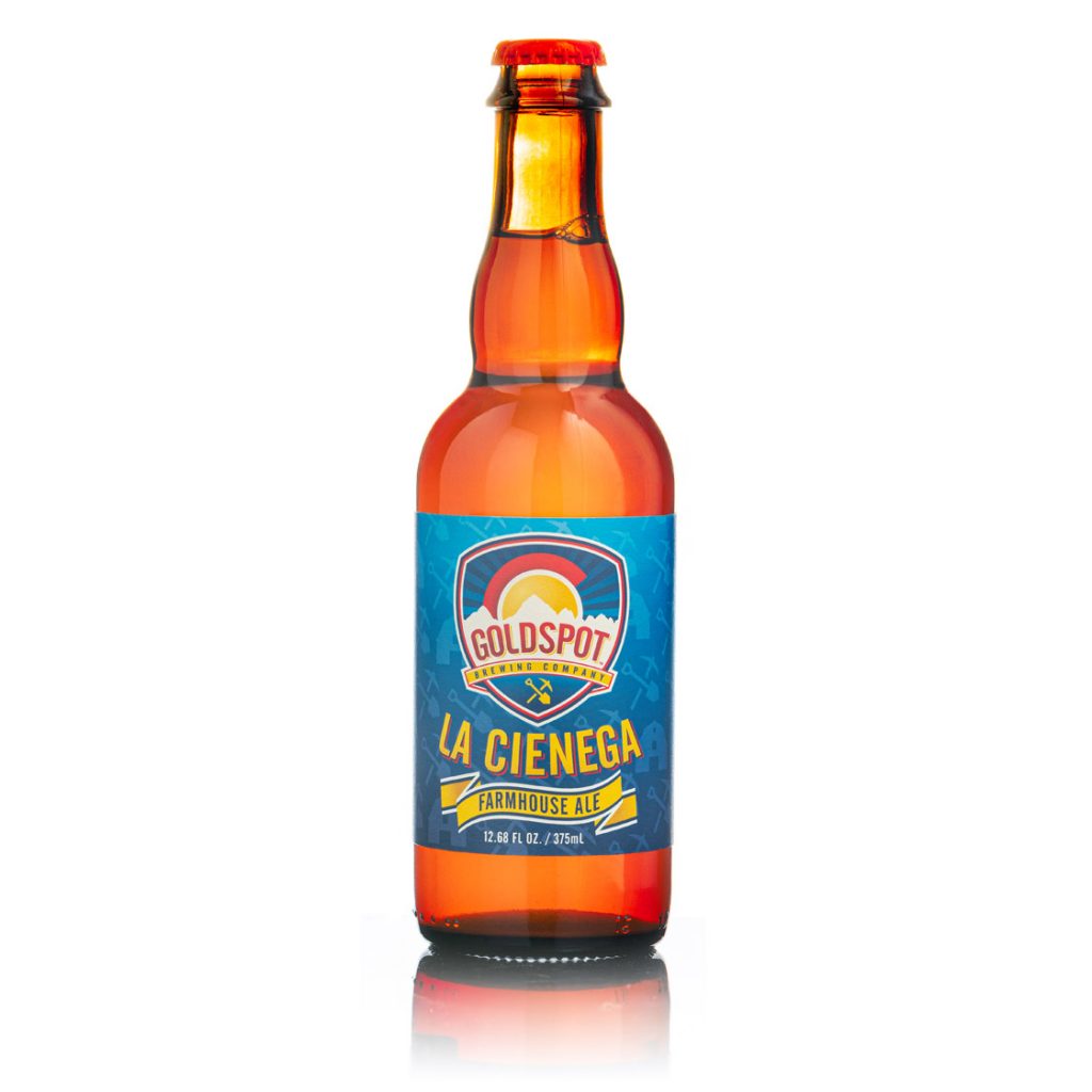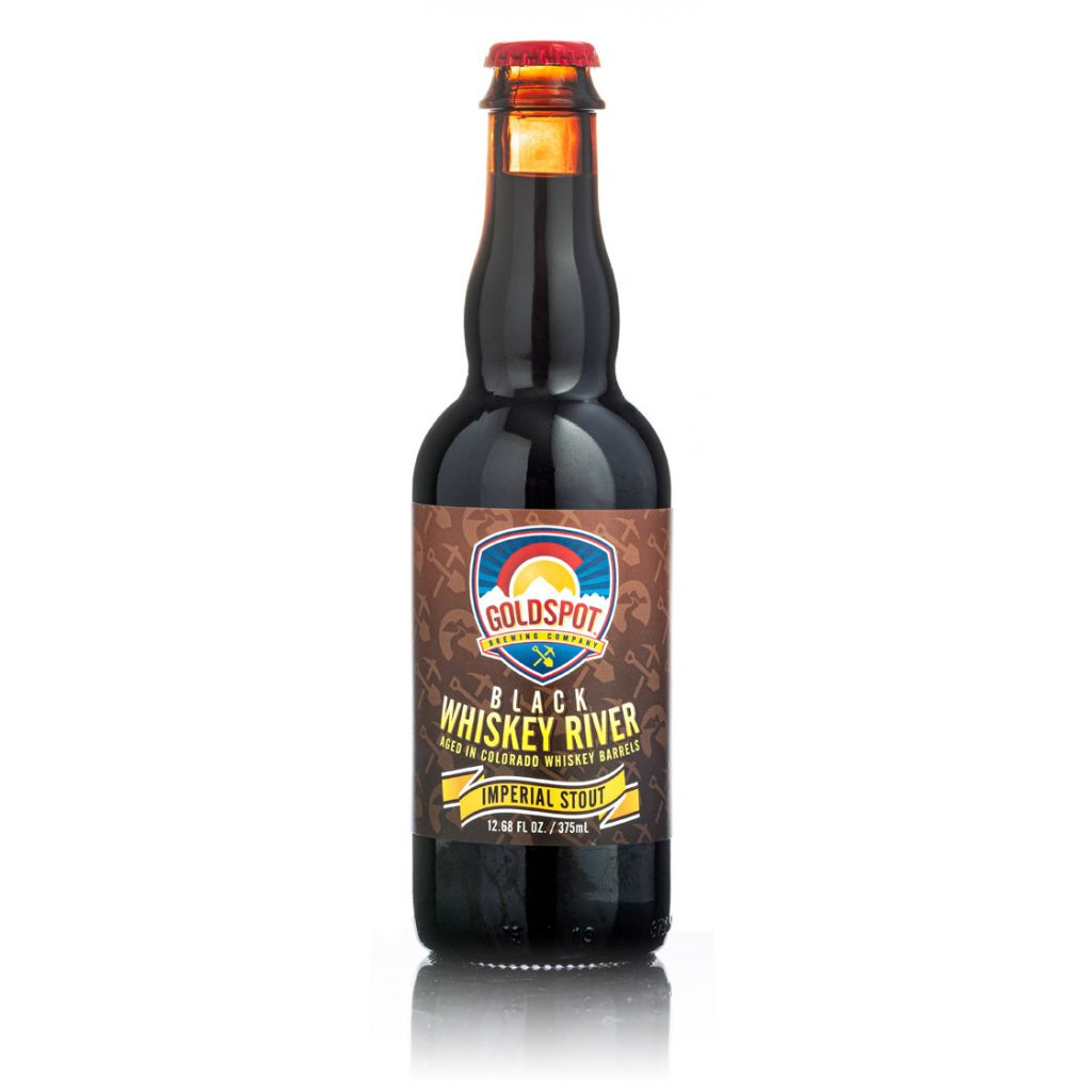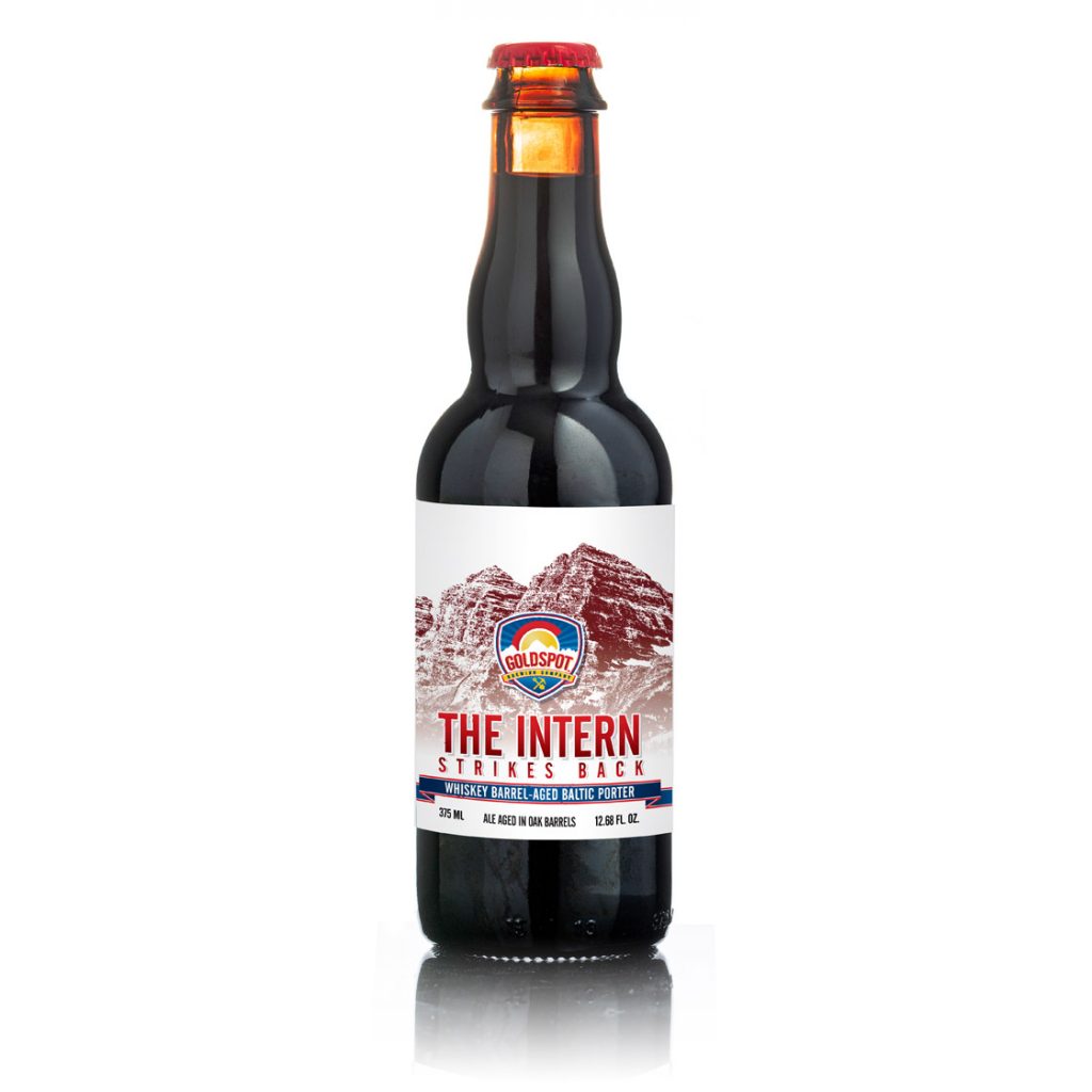

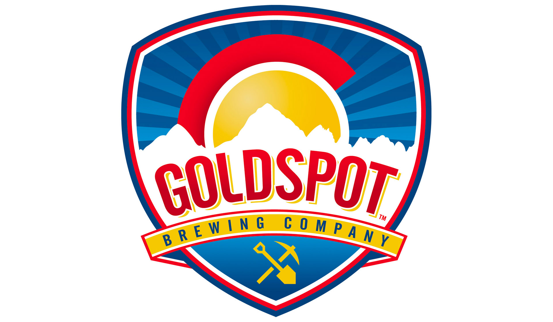
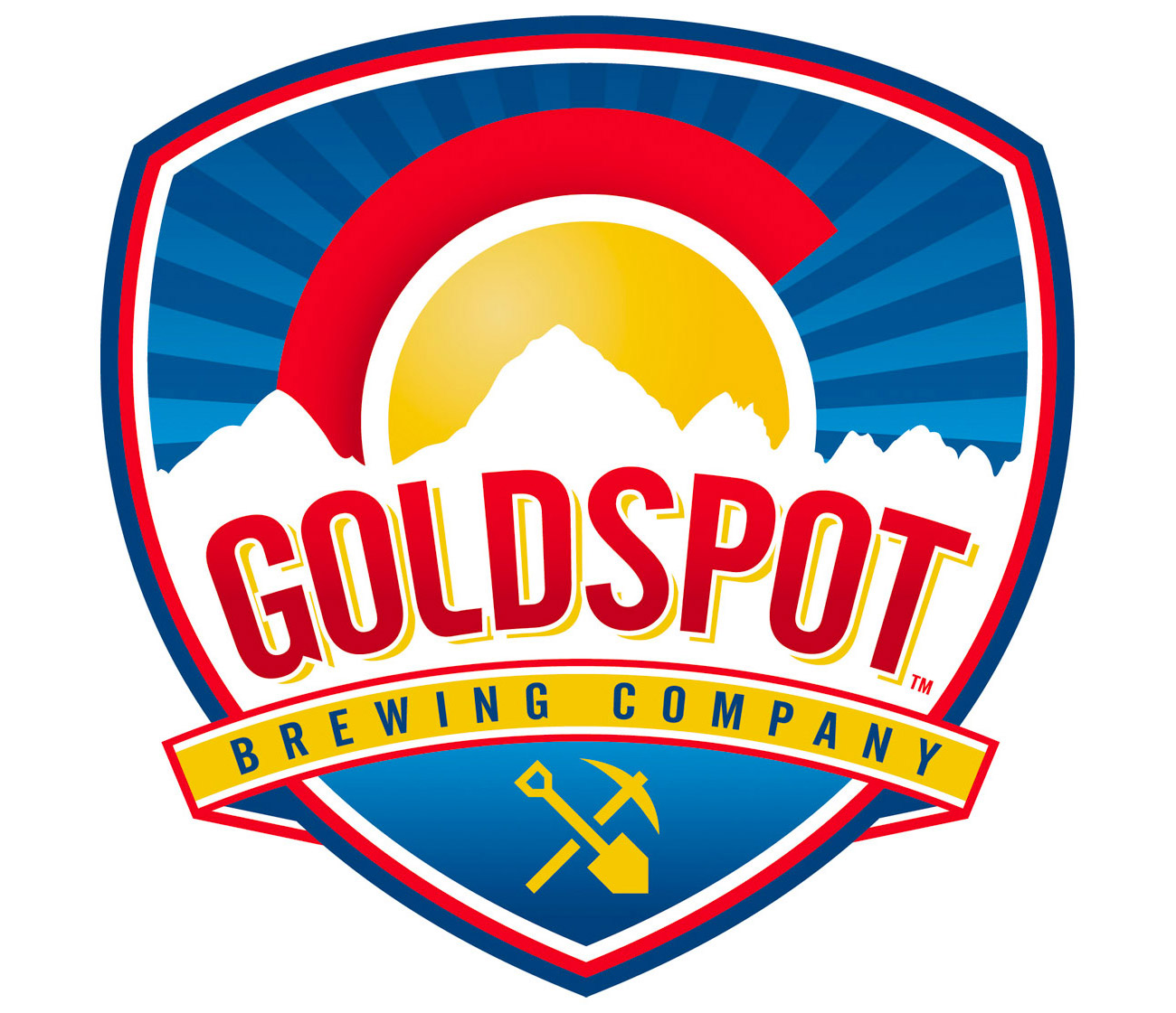
I was approached by Goldspot Brewing Company to do branding work for them. Now open at 50th and Lowell in the Berkeley Neighborhood of Denver (near Regis University), Fermentable Sugar worked with Matt Hughes & Alex Sward from Goldspot to identify what iconography they wanted to use in their logo. The brewery name comes from the yellow circle in both the Denver and Colorado flags. After researching the flags, it was determined that the gold disk in the flags not only stand for Colorado’s rich mining history, but also for our trademark sunny days throughout the year.
Through the design process, we developed a series of marks that would work for Goldspot. Each round we honed the marks and added a few new ones. Eventually, through some serious discussion, we ended up with a final. The resulting brand recalls the gold spot’s heritage while highlighting Colorado’s natural beauty, blue skies, and mountains. We developed a print and web branding package for Goldspot, a heightened contrast grayscale version, and a silkscreen/embroidery-friendly spot color version without the gradients to achieve better results.
![]()