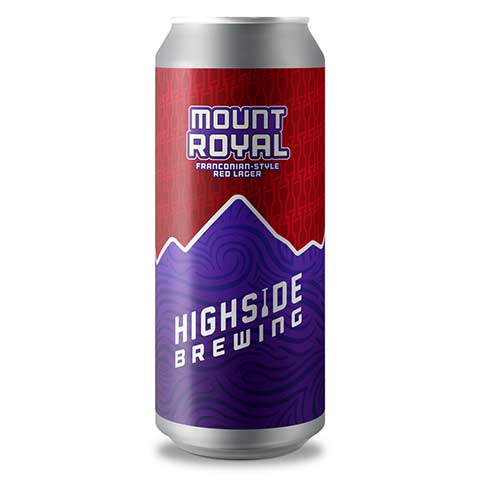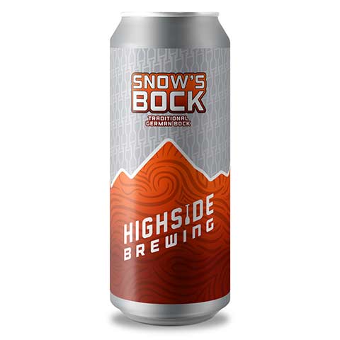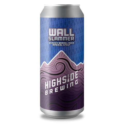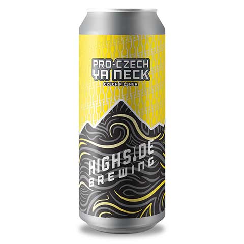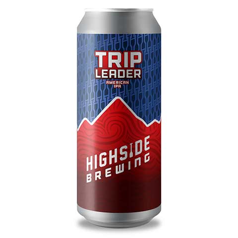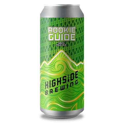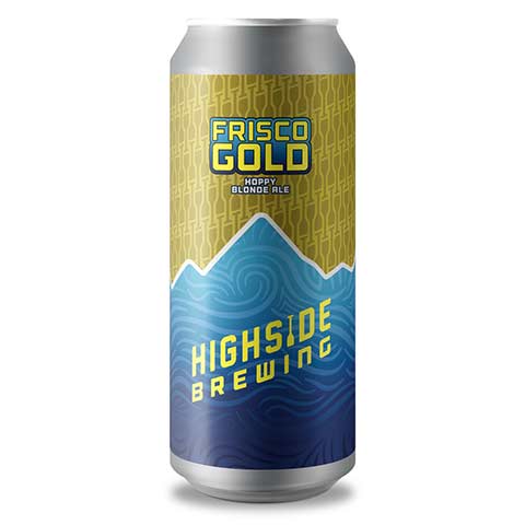

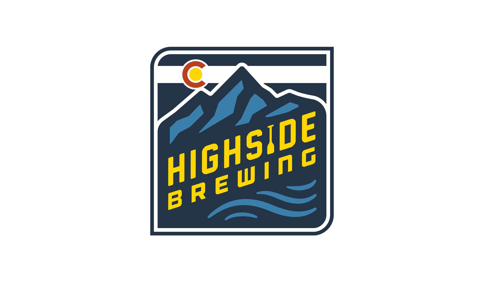
Highside Brewing came to us in early 2021 for some graphic design guidance. They were beginning to ramp up their brewing production to expand distribution throughout the Front Range of Colorado. We worked on a number of 16 ounce tallboy can designs but also took the opportunity to refresh their brand identity. A refresh was selected because we didn’t want to re-invent the wheel and start from scratch, but there were a number of elements in their branding that just didn’t work. A critical review of the old design showed us that we could increase the sense-of-place feel of the mark to better reflect “Colorado” as well as positioning them as outdoor enthusiasts who also make beer.
We added a better concept of water in the lower part of the branding, with curvy lines referencing the undulating our state’s rivers; this was especially important as the Highside founder is a rafting guide. We also replaced the 2nd I in “HIGHSIDE” with a raft paddle, as a secondary reference to this.
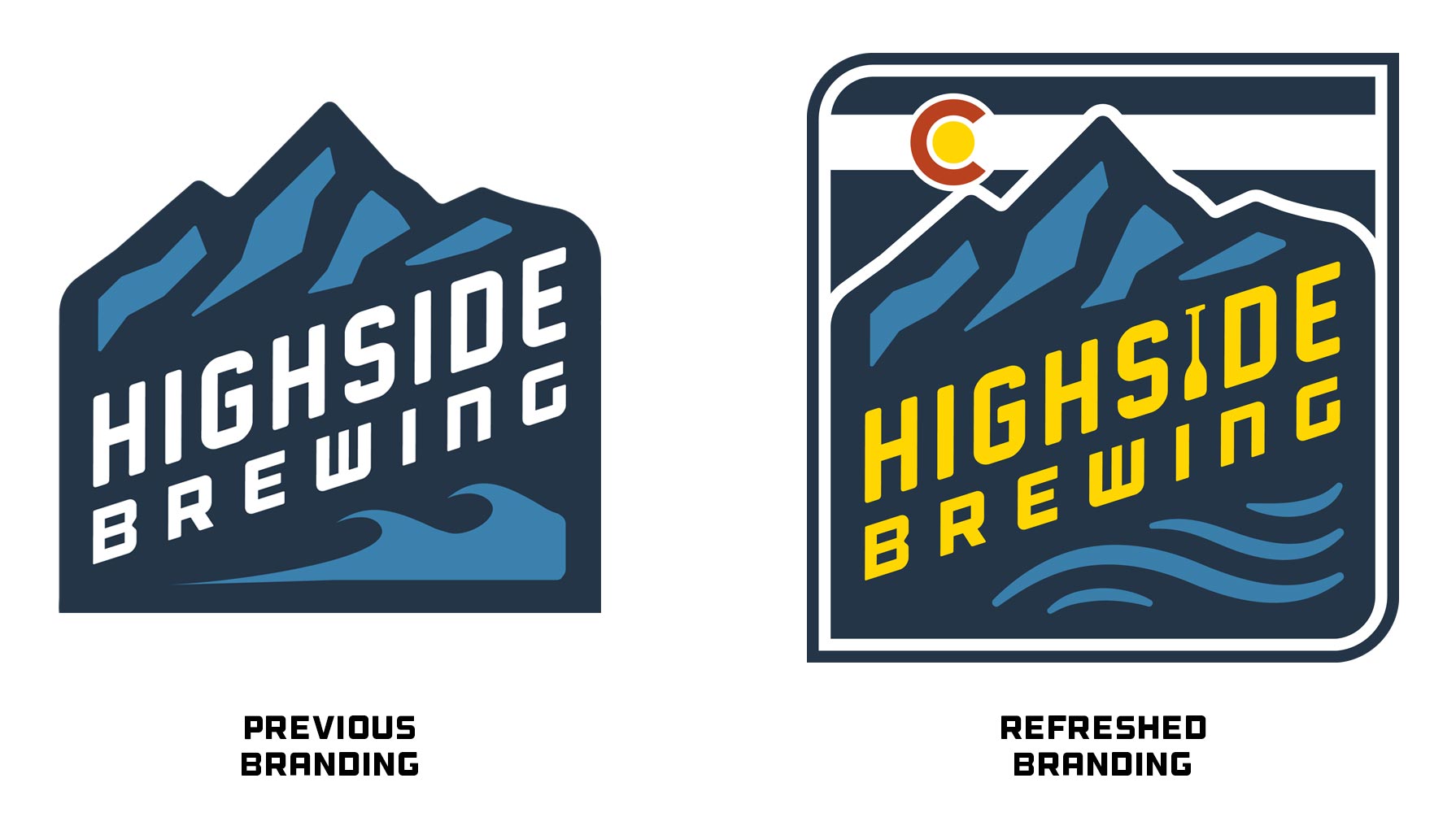
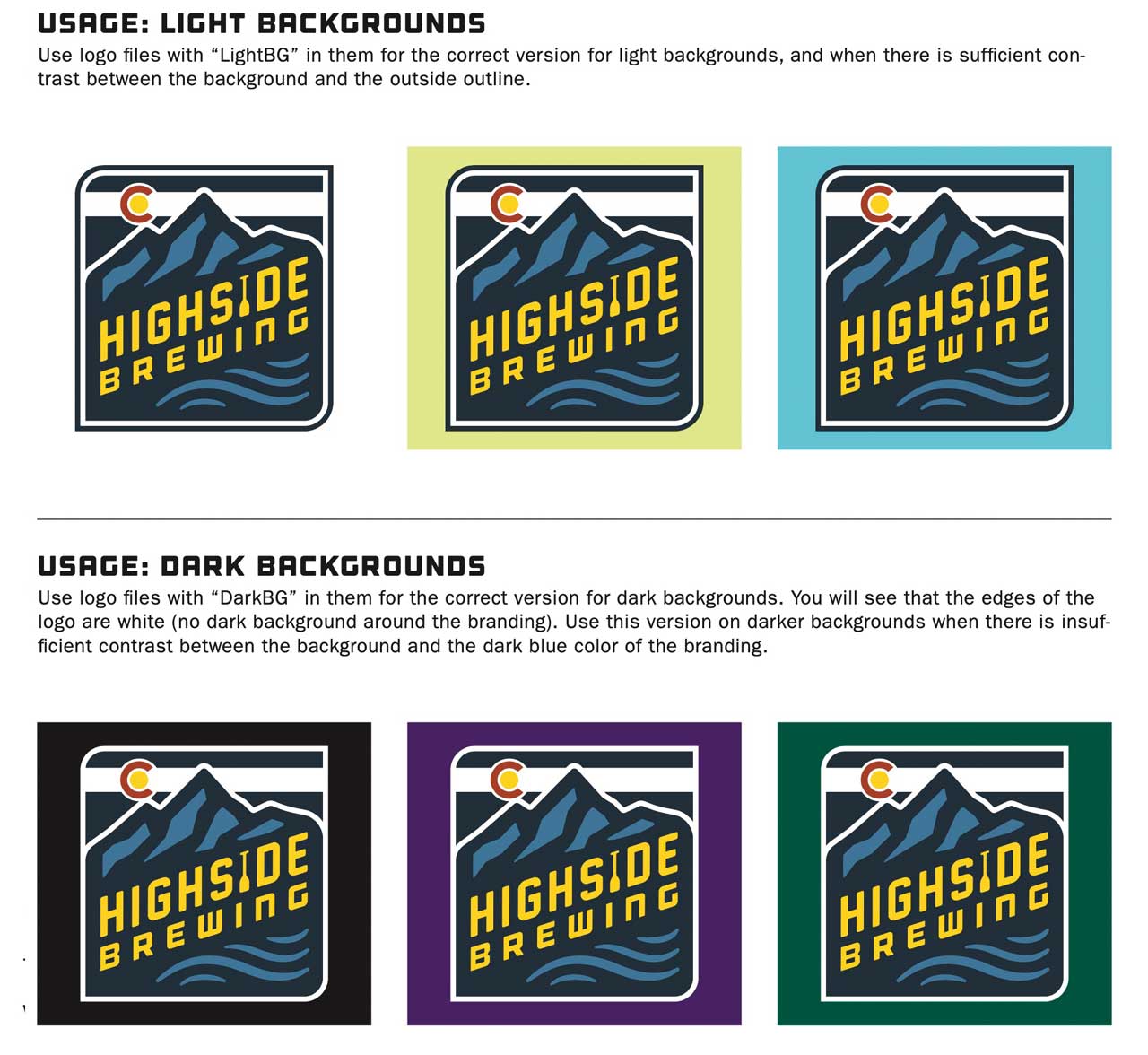
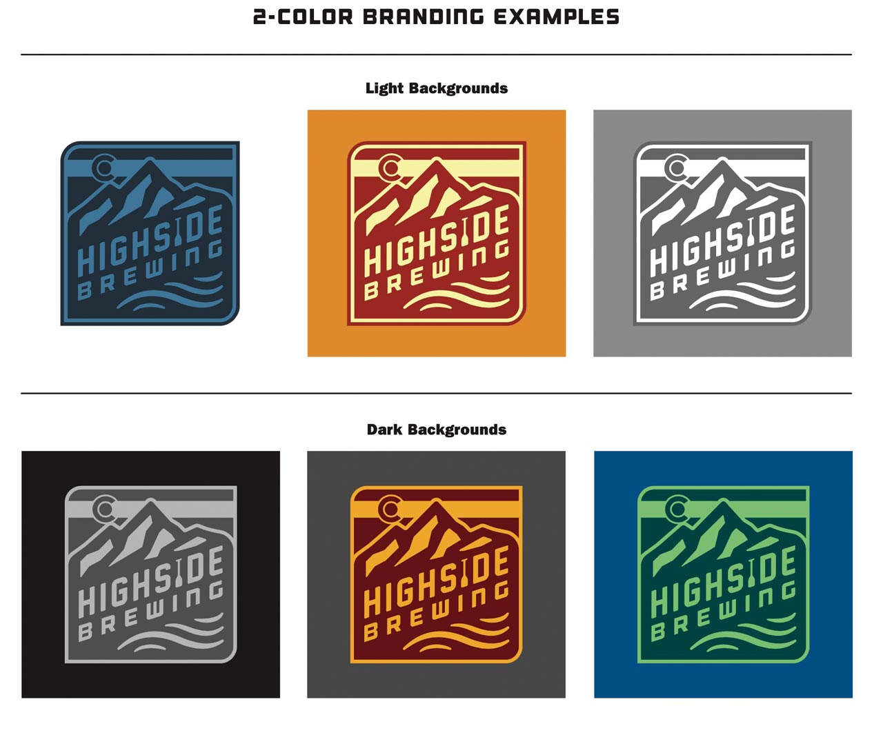
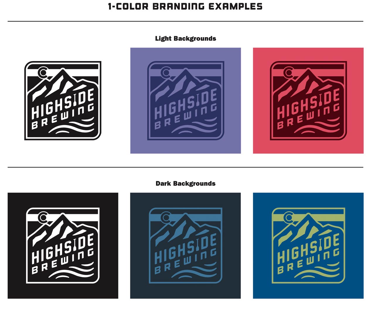
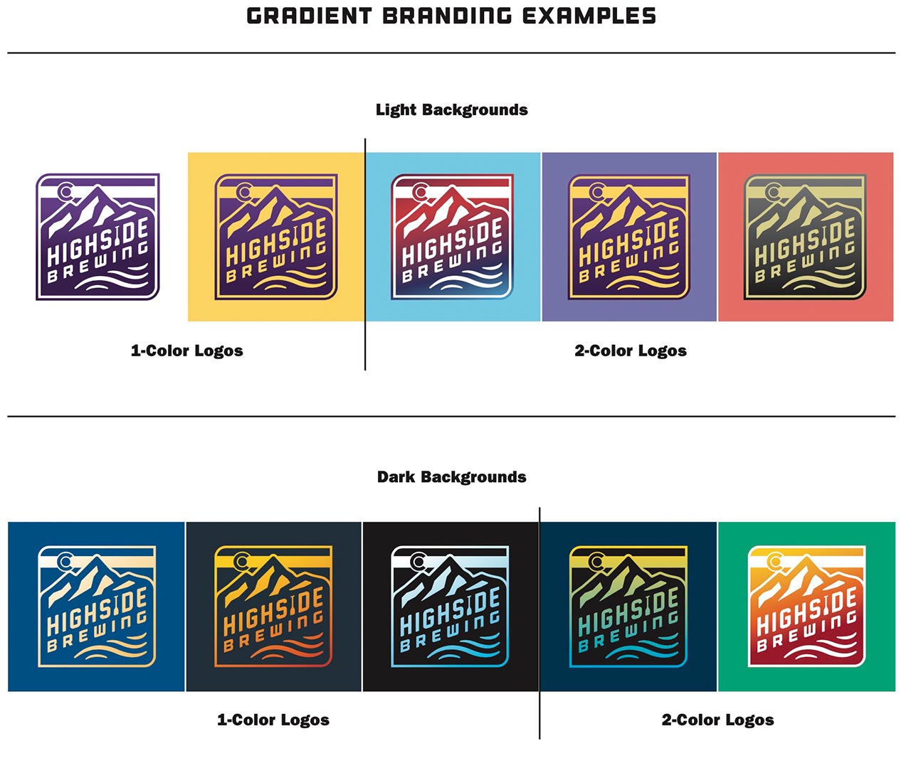
While the overall branding is similar to what Highside already had, we were able to refine their branding to make it so much more professional. The logo works great in full color, and in 1 and 2 colors, and with gradients. Their branding is meant to be very flexible color-wise, which is something we also reinforced in the subsequent packaging. We created a specialized branding package for the client that contains a wide variety of different logo uses and is supplemented by a Brand Standards Manual that explains how and where to use the branding in the future.